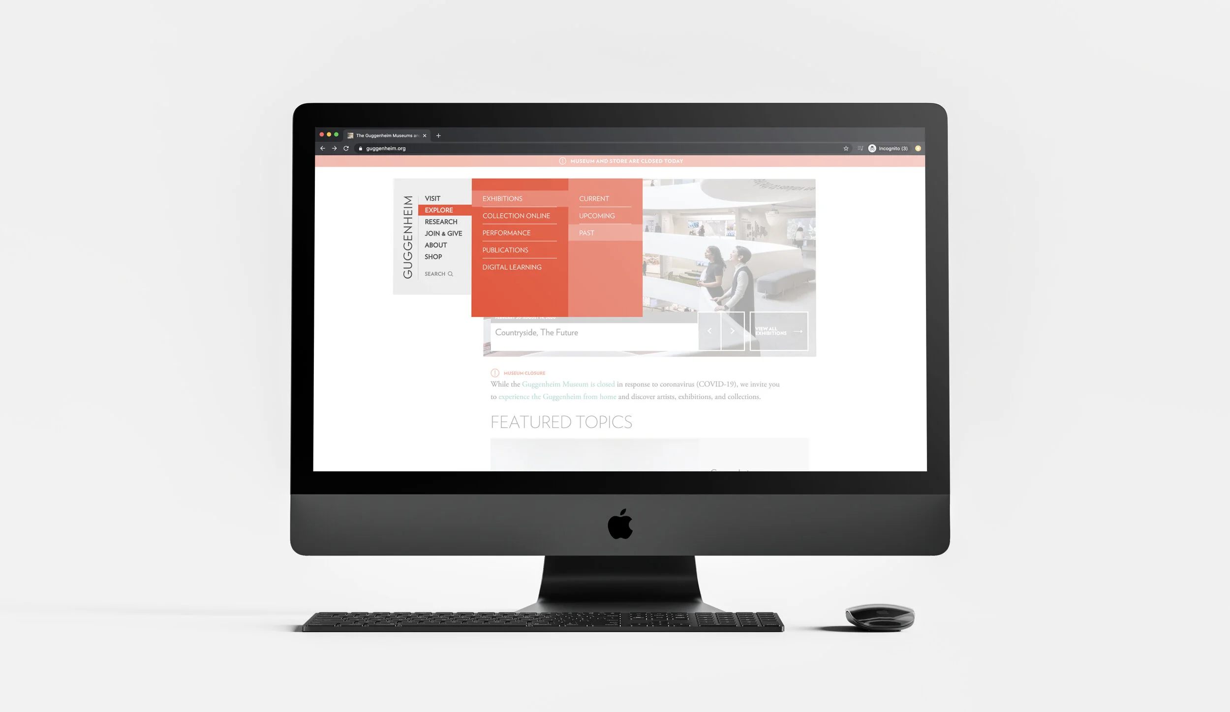
ReDEsign of Guggenheim’s Navigation
an improved visiting experience with better accessibility and Information architecture
It is no secret that Guggenheim is widely known across the globe as modern art curators and is constantly innovating and exploring ideas across cultures through various initiatives and collaborations. However, how disappointing would it be if visitors cannot find all that about them on their website?
“To improve is to change; to be perfect is to change often.” — Winston Churchill
MY ROLE
UX Designer, Information Architect
DURATION
2 weeks
TOOLS
Figma, Optimal Workshop
The challenge
As a leading modern and contemporary art museum, Guggenheim has a wide range of offerings for their visitors. However, their website navigation hinders their ability to shine through and to allow visitors to easily find the information they need to optimize their browsing experience.
Design PrOCESS
Competitive Analysis
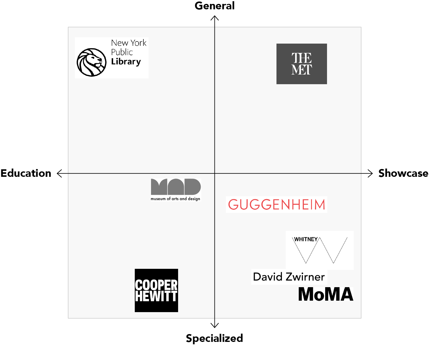
We completed a competitive matrix to identify Guggenheim’s direct competitors and to learn how they compared in terms of:
General vs. Specialized: Determine whether they cover a wide range of categories or specialized in very specific focus areas
Education vs. Showcase: Determine whether their value propositions are more towards teaching users about their key areas or more towards curating inventory for display and viewing
We found that their closest competitors are the Whitney Museum, David Zwirner Gallery and MoMa as they all sat in the same bottom right quadrant — a focus on showcasing specialized artwork.
PERSONA
Through initial user research, I created Florence to represent the target audience of the website.

FLORENCE, ART STUDENT, 22
Florence is an art student and she likes to visit museums in her free time. Some of her needs include the ability to find what is currently on display in the museum, visiting information such as hours and pricing, and to explore new artists.
CURRENT DESIGN ANALYSIS
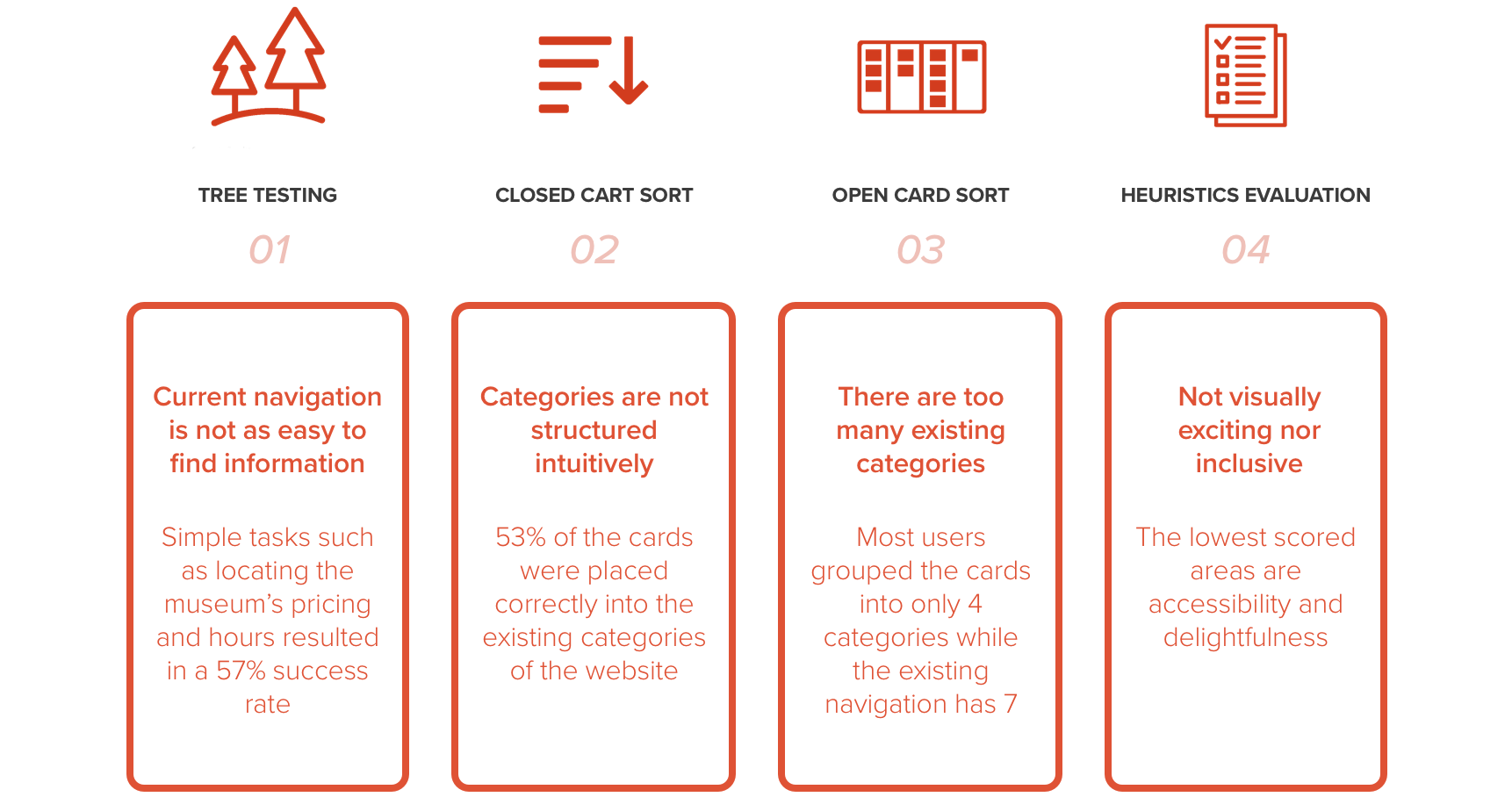
To better understand the usability of the existing navigation and information architecture, I used the tree testing, open and closed card sorting, and heuristics evaluation methods to gather research insights.
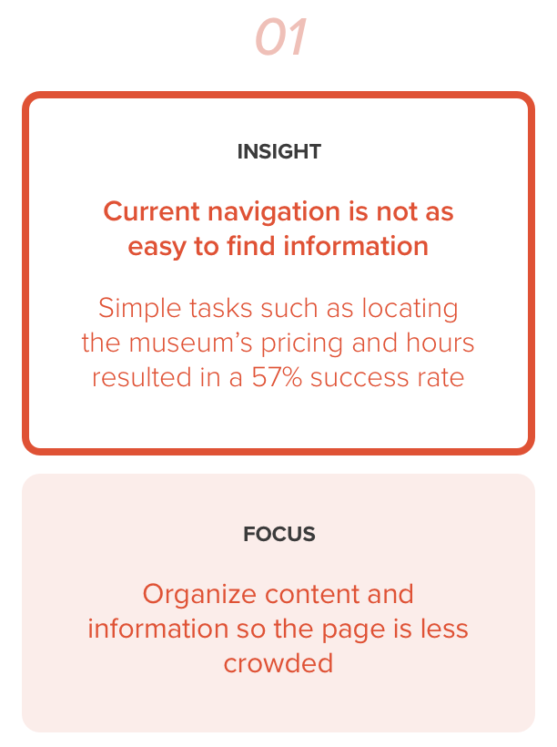
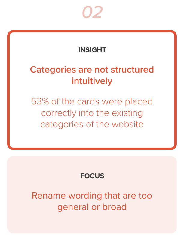
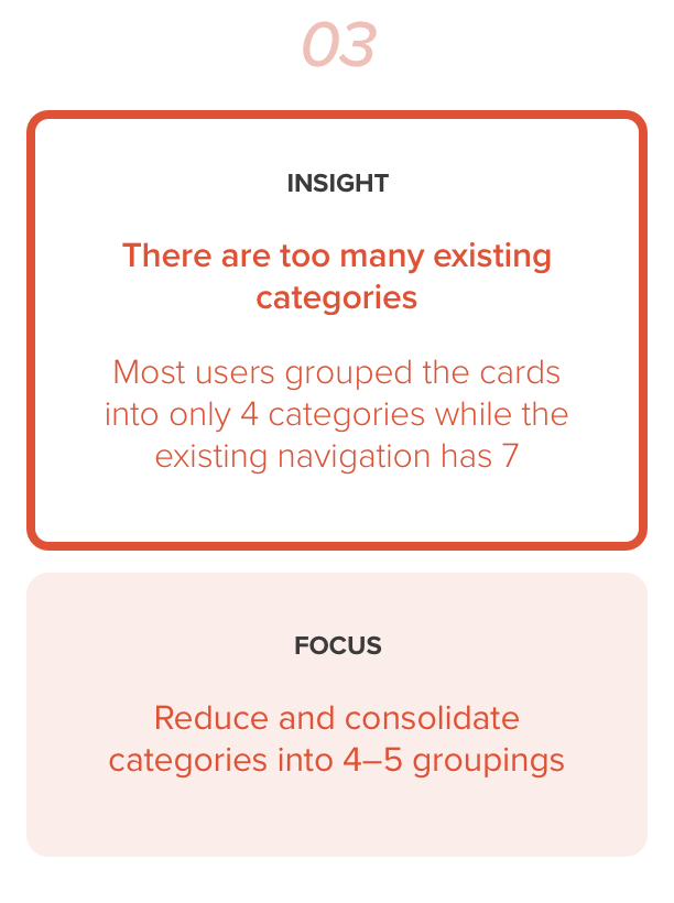
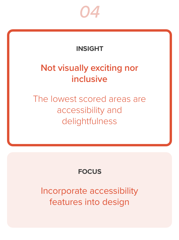
Here are the key findings:
Problem statement
How might we help Florence easily find information to plan her visit to the Guggenheim museum?
FOCUS AREAS
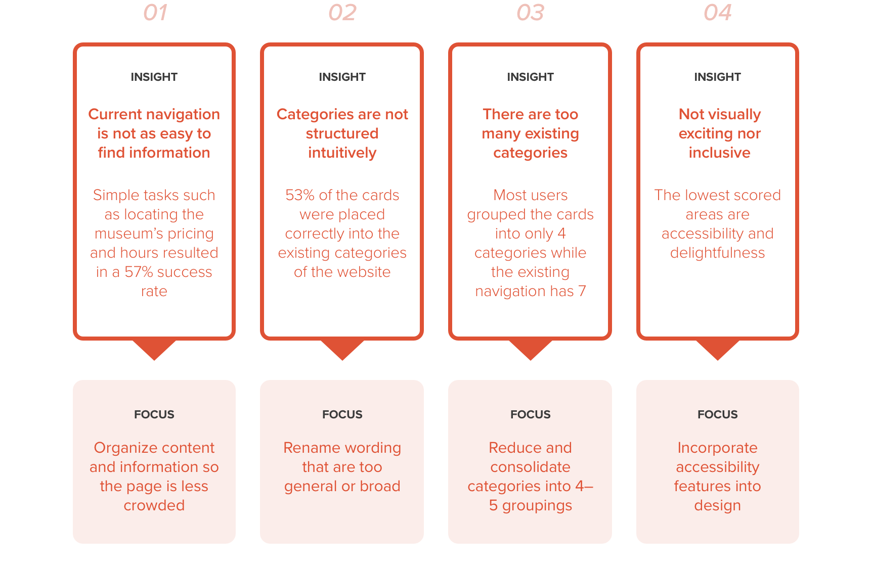
Through what I learned from research, there are four key focus areas for the navigation redesign that will help users like Florence easily find visiting information and discover new artists and artworks.
Proposed DEsIGN
To help Guggenheim visitors and Florence easily find information they need on their website, I redesigned the current navigation’s visual styles and information structure by incorporating the four key focus areas I gathered from research.
With these changes, I was hoping to improve on the accessibility features and to create a better user experience with the newly designed nested menus.
REDESIGN ELEMENTS
VALIDATION
With the redesign, I wanted to validate if the changes made it easier for the users to find information through the navigation system. This was analyzed using the same tree testing and card sorting methods as before.
Here are the key findings:
Some things that worked:
Breaking big pages up to smaller pages helped users find information
Rewording the categories and links helped clarify information for users
Some things that still need work:
Explore and Research are the most conflicting categories for users. Therefore, more analysis should be done to determine clear distinctions between the two
Users associate membership payments with the Shop category so it may need to be relabeled to clarify what the shop includes